7 Ways to Use Color Psychology in Home Staging to Speed Up Sales
Master the science of color to evoke emotion and close deals faster.
The Hidden Language of Color in Real Estate
Ever walked into a house and felt an immediate sense of peace, even if you couldn't quite put your finger on why? Or maybe you’ve stepped into a living room and felt a strange, low-level anxiety that made you want to cut the tour short? That isn't just a coincidence; it’s psychology. Specifically, it’s the way our brains process color and light.
When we talk about color psychology in home staging, we aren't just picking pretty paints. We are strategically engineering an emotional response. For real estate professionals, understanding this science is like having a secret key to a buyer’s subconscious. In a market where first impressions are made in seconds—often through a smartphone screen—the colors you choose for a listing can be the difference between a scheduled showing and a scroll-past.
Let’s dive into how you can use the power of hue, tint, and shade to make your listings feel less like a house and more like a future home.
1. Start with the "New Neutral": Why Greige Still Reigns
We’ve all heard that neutrals are the safe bet, but there’s a psychological reason for it. Neutrals like "greige" (that perfect marriage of grey and beige) provide a cognitive "blank slate." When a buyer sees a neutral wall, their brain doesn't have to work hard to process the environment. This lack of visual "noise" allows them to easily overlay their own lives onto the space.
However, the trend is shifting away from the cold, sterile greys of the mid-2010s. Modern buyers are looking for warmth. Using soft whites with warm undertones or earthy beiges creates a sense of security and cleanliness. If you're debating between a full repaint or a digital touch-up, consider checking out our guide on virtual staging vs. physical staging to see how you can test these palettes before committing to a contractor.
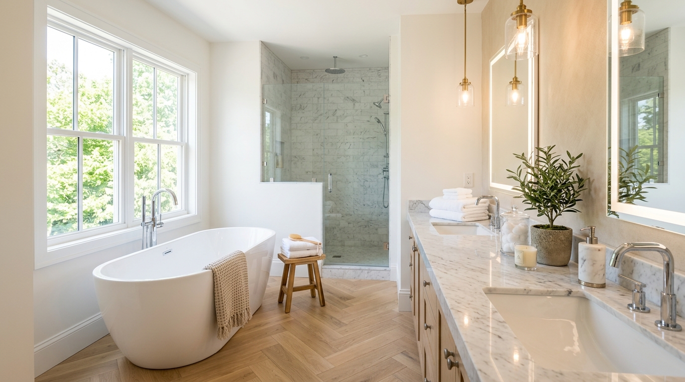
The "Safe" Psychology
- White: Symbolizes purity and cleanliness. Perfect for kitchens and bathrooms.
- Beige/Tan: Evokes feelings of dependability and steadfastness.
- Soft Grey: Offers a modern, sophisticated edge without being polarizing.
2. Use Blue to Create a Spa-Like Sanctuary
If you want a buyer to linger in a primary bedroom or a master bath, reach for blue. Blue is arguably the most powerful tool in the color psychology toolkit because it is universally associated with the sky and the sea. It lower's the heart rate and creates a sense of tranquility.
In home staging, we often use "watery" blues—soft teals, duck-egg blues, or pale navies. These colors suggest reliability and peace. When someone is stressed about the massive financial decision of buying a home, walking into a room that feels like a spa can be a massive relief. This is a classic example of using emotional visual triggers in real estate marketing to lower a buyer's guard and make them feel "at home."
Pro tip: Don't go too dark with your blues in small rooms, as it can make the space feel cave-like. Stick to accents or soft washes of color on the walls.
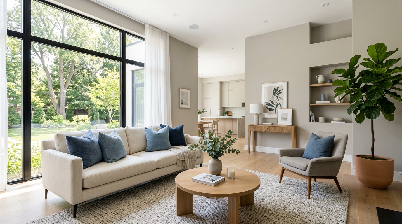
3. Bring the Outdoors In with Natural Greens
Green is the color of growth, renewal, and—importantly for real estate—wealth. But more than that, green has a profound physiological effect on humans. It’s the easiest color for the human eye to process, and it creates a bridge between the indoor environment and the natural world.
In modern staging, especially for "eco-friendly" or suburban homes, muted greens like sage or olive can make a kitchen or a sunroom feel vibrant and healthy. It suggests a lifestyle of wellness. Even if you don't want to paint the walls green, you can achieve this effect through "biophilic staging"—adding potted plants, eucalyptus branches, or green velvet pillows. This works exceptionally well in bedrooms; for more specific layout ideas, see our post on how to stage a primary bedroom for photos.
4. Warm Up the Entryway with Welcoming Tones
The entryway is where the "First Impression Clock" starts ticking. You have about seven seconds to win over a buyer. Using warm colors like soft yellows or muted terracottas in the foyer can trigger feelings of happiness and optimism.
Yellow is a high-energy color, so a little goes a long way. Think of a bowl of lemons on a console table or a golden-toned rug. These splashes of warmth suggest a sunny, cheerful household. It’s about creating a "welcome home" vibe that resonates the moment the key turns in the lock.
5. Avoid the "Red Alert": Managing High-Energy Colors
Red is a controversial color in real estate. Psychologically, red increases the heart rate and stimulates appetite (which is why many restaurants use it). However, in a home environment, it can also trigger a sense of urgency or even aggression.
If a seller has a bright red dining room, it’s usually best to suggest a neutral overhaul. Why? Because red is a "demanding" color. It demands the buyer's attention, often distracting them from the home's architectural features. If you must use red, keep it to tiny pops of color—maybe a single piece of art or a decorative book on a coffee table. You want the buyer looking at the crown molding and the floor plan, not the fiery walls.
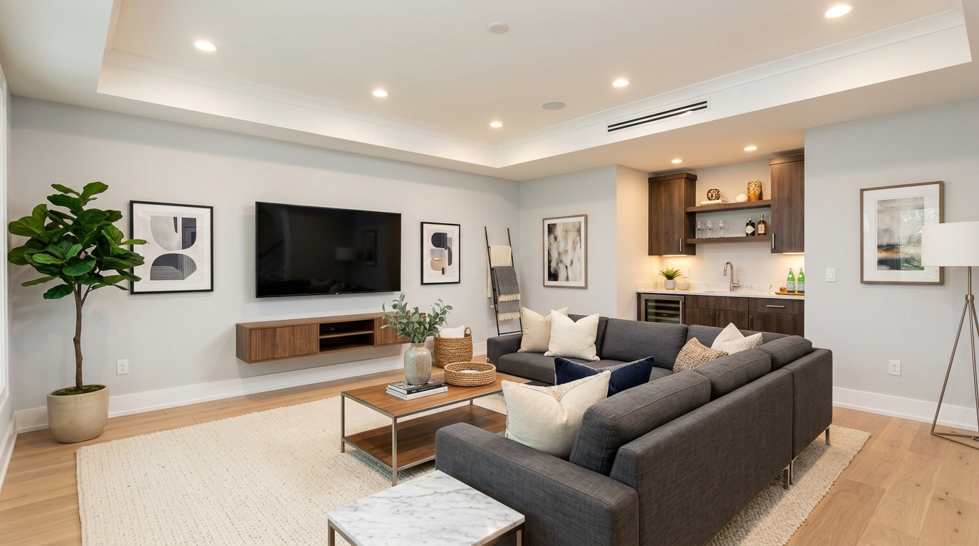
6. Master the 60-30-10 Rule for Visual Balance
Color psychology only works if the colors are balanced. If a room is 100% blue, it feels depressing. If it's 100% white, it feels like a hospital. Stagers use the 60-30-10 rule to ensure the brain feels comfortable in the space:
- 60% Dominant Color: Usually a neutral (walls, large rugs).
- 30% Secondary Color: Provides contrast (upholstery, curtains).
- 10% Accent Color: The "pop" of color (pillows, artwork, floral arrangements).
This ratio creates a visual hierarchy that makes a room feel "professionally designed," which subconsciously increases the perceived value of the property in the buyer's mind.
7. Factor in Lighting: How Color Changes with the Sun
A color that looks like a beautiful "seafoam green" at 10:00 AM can look like "hospital green" at 4:00 PM. Color is essentially just reflected light, so you have to consider the orientation of the house.
- North-facing rooms: The light is cool and bluish. Warm up these rooms with slightly more yellow-based neutrals.
- South-facing rooms: These get intense sunlight. You can afford to use cooler tones like greys or blues here to balance the heat.
- West-facing rooms: These get a warm, orange glow in the evening. Be careful with yellows here, as they can become overwhelming.
When you are preparing for your listing photos, remember that the camera sees color differently than the human eye. Always test your staged colors under both natural and artificial light to ensure they translate well to the screen.
The Bottom Line: Color Sells
At its core, color psychology in home staging is about removing friction. Every time a buyer reacts negatively to a color choice, you’ve added a hurdle to the sale. By choosing colors that evoke calm, trust, and happiness, you’re making it easier for the buyer to say "yes."
Are you ready to elevate your listing presentation and justify your full commission? Using these psychological insights is just the beginning. Combine great staging with high-end visuals, and you’ll find that homes don’t just sell—they sell for a premium.
Want to see how professional visuals can bring these colors to life? Contact The Listing Showcase today to schedule your next shoot!